How food shapes the world.
Applied Data Analysis project @EPFL
Célia Benquet, Alexandre Hutter, David Notzon and Kamil Seghrouchni
Introduction
7.7 billion people around the world in 2019 and still no viable solution to provide food to everyone!
As for now, intensive agriculture expansion has been the only realistic solution, but let's be honest, with the raising awareness on climate change and environment, very few people believe that it is a viable solution in the long run. With this "guide" on how agriculture is currently shaping the surface of the world, we would like to provide a line of thoughts on the destructive foodstuffs and conversly the products that would deserve our attention to reshape the future of our alimentation.
Our investigation is based on data sets from FAOSTAT, published by the United Nation and related to food and agriculture. It gives us a really broad set of informations to answer to our problematic.
First of all, we endeavor at providing an exhaustive visualization of the world under growing food reshaping pressure by presenting global tendancies. Subsequently, the impact of intensive exportation on biomes area loss is investigated in order to see if agriculture directly impinged on natural biomes and if some foodstuffs can be classified as “destructive” for the environment. Going one step further, we established an indice that tackles with both social and environmental awareness concerns to advise countries on which food to grow.
Hence, we will try to answer the following questions:
- What is the global evolution of the production quantity per country from 1995 to 2007?
- What is the area lost of savanna, shrubland, grassland and forest per country over a year?
- Do we see a correlation between the area lost by ecosystems and exportation?
- Can we find an indice to rank foodstuffs and advise countries on how to extend agriculture in a more sustainable way?
Data Investigation
The FAOSTAT data sets are broad in information and a first important part of our investigation was to find the appropriate data sets to precisly answer our problematic. We use 4 data sets from FAOSTAT and one from web scrapping on the Wikipedia article "List of countries and dependencies by area". The 4 data sets give informations by year and areas. Areas can be at different scales, from countries to continents, going to economical segments. They are the following:
- Data on crops, which we reduced to 2 elements of informations, the area harvested and the production quantity for each foodstuff or categories of products.
- Data on export and import, with two different parts, the quantity of products and the monetary value of these exchanges.
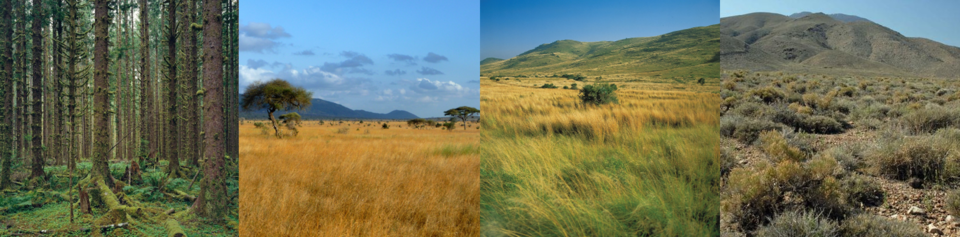
- Data on burnt savannas surfaces, for which we only keep the main categories of biomes, Savana, Shrubland and Grassland.
- Data on burnt forests surfaces, which is very similar to the data set on savannas.
We will join the two last ones to form a "Biomes" data set that we can compare to the "Area of Crops" one. We also add a column corresponding to the percentage that a given area, loss of biome or gain of cultivated surface, represents in the total surface of a country. To answer questions about link between elements, we calculate a lot of correlations that we present in the analysis.
Global Tendancies
We will first introduce our data using world maps to find general tendancies to be explored in the rest of the analysis.
Let's have a first glimps at the major actors in the field of agriculture. The following maps depict the repartition of production and export in the world and give interesting insights on which countries "feed" the world through time. More precisely, for each country, we calculated the percentage that each country represent in the global production of food and display the net production in.
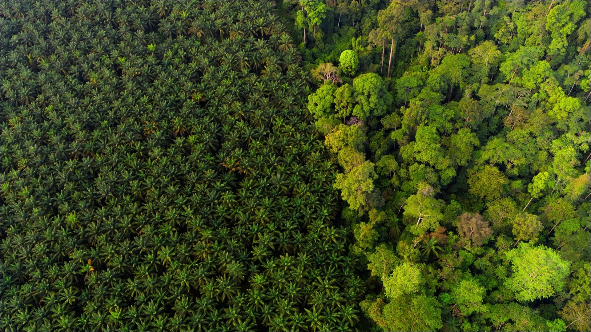
First of all, we observe a global augmentation of production that we can explain by the mondial demographic expension (around 6 billions in 1995 and 7 billions in 2007, ONU). In 1995, the major productors are already China and northern America. However, we can see an increase for emerging countries such as Brazil or Maleysia, especially on the island of Borneo, known for losing its primary forests to produce oil palm. We can also see a slight increase in some African countries such as Angola or Egypt. On the contrary, countries in Europe seem to represent a smaller part of the global production.
From these observations, we could suppose that emerging and developping countries present a strong demographic expension and that they need more food for their population as a result. However, it could also be that in order to develop, they focus their economy on agriculture and they export more whereas developped countries expended their industries or new technologies instead. To confirm one or the other hypothesis, we can look at the part of mondial exports countries, represented through time.
Here again, there is a clear mondial increase of exports as the quantity exported is higher for all the countries. It can be explained by mondialisation and a general improvment of transportation. Even if top-ranked exporters in America are still the same from 1995 to 2007, we can see major changes in Asia with the emergeance of Russia, China, or Kazakhstan. For Africa, even if Libya lost in rank, it seems like most of the countries slightly increased their part in the global exports. Of course, we need to consider the results carefully to affirm anything as a lot of factors are at play It correlates with our hypothesis on an economy largely based on agriculture as most countries which produce more also export more.
Now we have an idea of the countries that "feed" the world. As we want to include environmental impacts of our behaviours as a society, we considered that exportation is not necessarily a solution to a sustainable economic development. Indeed, it leads to transportation through the world, which emits CO2, but also neglecting of the local populations and local natural biomes for the benefit of the economy. That is why we decided to investigate into the area loss in different natural biomes through the world. Before looking for a correlation with exports, we first have a glance at the mean annual area loss for each studied biomes.
To synthetize the area losses, we see that, for each country, there is an annual loss of the biome present. Forests are destructed mostly in South America (Amazon forest), Malaysia/Indonesia (Borneo forest) and central Africa (Conga Bassin forest). Grassland corresponds to Australia and Kazakhstan. Savanna is found mostly in Africa and shrubland in Australia and Senegal.
We had a first insight on what to expect from those data. To try and justify our hypothesis, we will start to link factors together.
Reshaping the world
Destructivity of the crops
Now, the study will shift toward the destructive impact assessment of selected crops on the biome it is being cultivated in. Such impacts depicts the originally raw surface which is transformed for cultivation puroposes. More precisely, a crop will be considered as destructive if its culture is mainly meant for satisfying global food demand compared to local needs. This will allow us to get the impact of global food trends on local landscape. One should however mention that imports followed by exports for specific crop are considered here as originaly produced by the concerned region.
In order to asses this impact, we considered correlation between export quantity and area loss for a specific geographical area and biome. As the orginal cause for such area loss is absent from our data, a strong correlation would suggest that culturable lands tookover. Hence, the higher is the correlation coefficient, the higher the area loss.
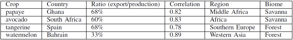
As a side note, we used an arbitrary threshold of 0.7 (absolute value) for the correlation coefficient. Thus, any crop having a correlation over this threshold was considered potentially harmful to the local landscape.Conversely, any value under this threshold was not taken into account. The resulting correlations are shown on a heatmap.
First, one can observe that such high coefficiant are experienced for the Forest vs Region loss shown above. For instance Western Asia lands seem to have been affected by Watermelon demand over the years. European regions also display high coefficiant and such for several different crops. However one should mention the quite high number of negative coefficiant (below -0.7). Further analysis would have required additional information for interpretation.
One theory would be that the time span for crop growth is sometime long. For instance, growing palm trees would take around 4 years for oil export. Knowing that, land expansion for that culture could not instantly be followed by production growth. More over land expansion is not continuous but pulse stage like.
On the other hand, since satisfying global food demand is considered harmfull for local lands, another metric was taken into account. After dividing exports by production quantity, a ratio was obtained to depict the production yield that was meant for global demand. That way if a crop is mostly produced for exportation in a given country and a strong correlation is being experienced for country's region as well, one could state that the crop has a destructive outcome. Using both informations, this study outlines a subset of countries for wich crops were considered to have a shapping effect.
One should however mention the limits of negative crops detection. Since crop culture depends on multiple factors such as: local environement, economical context, geographical situation ... It can quickly become a hard task to state overall negative crops. Being country specific guarantees that the above mentioned are matched for a given crop.
Index of sustainability
Now that we have a list of crops to avoid at all cost, for four countries (Spain, Ghana, South Africa and Bahrain), we will try to recommend substitutes to cultivate. Those will have to be mainly intended for national use and not exportation. Furthermore, the culture yield (Quantity produced/Quantity harvested) should be as low as possible to avoid the expansion of cultures. A few optimal replacement crops will be listed and left to the countries authorities to choose. To this we added the price per ton at which the crop is usually sold during exportation. This gives an economic element to our study. Nevertheless, the focus should still remain to prevent further expansion of cultivated area. With all those criteria we give the opportunity for countries authorities to choose among our selection. Here are the features that we used to get the suggestions :
- The quantity which is used locally
- The surface yield
- The economic yield
The quantity which is used locally is simply measured as the percentage of production which is not exported. For its part, the surface yield is measured by the production quantity in tonnes over the area harvested in hectares. This represents the efficiency of the crop culture with respect to the allocated space. Finally, the economic yield is calculated by dividing the exported value for a crop (Dollars) by the exported quantity for that crop.
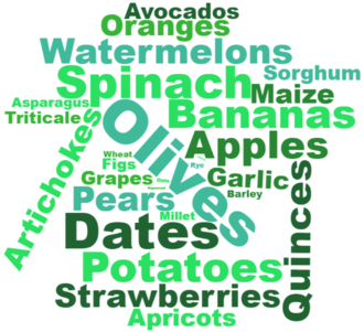
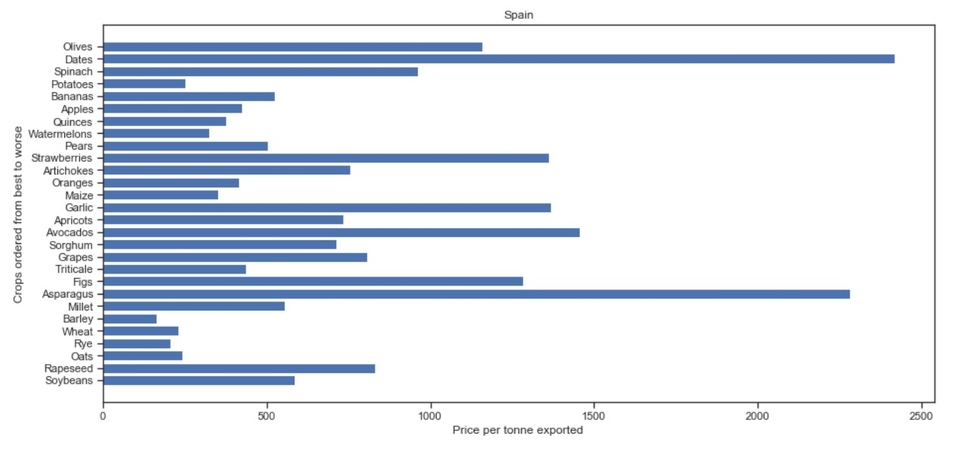
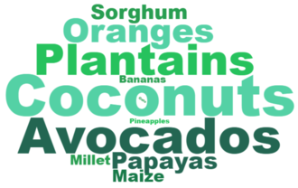
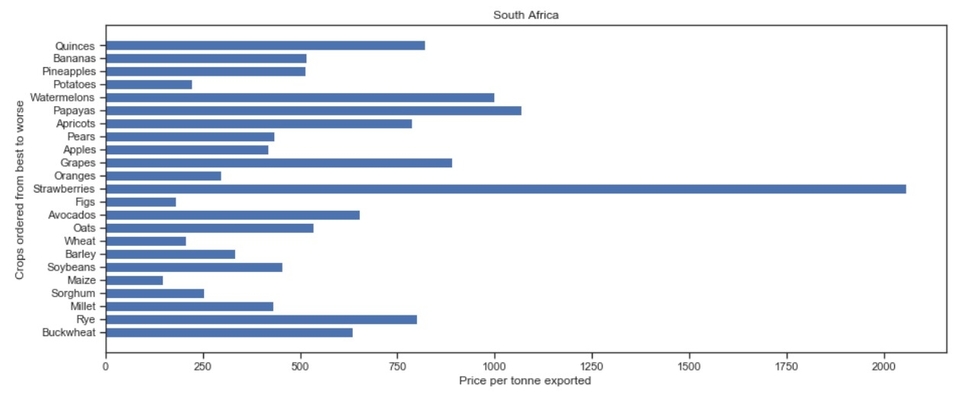
Let's now see the result we obtained for the four countries mentioned. First, for Spain, the olives arrive first and then close second are dates. The result are shown in the histogram plot. The crops are listed from the upper one being the best and as we go down on the y-axis the crop becomes less appropriate. Olives and dates are two typical crops found in Mediterranean regions. They are mainly destined for national consumption. We strongly recommend replacing the exportation of tangerine with the culture of such optimal crops, which have even higher values in dollars at exportation than tangerine. The best crops are represented by the word cloud, with the font size increasing as the crop is better.
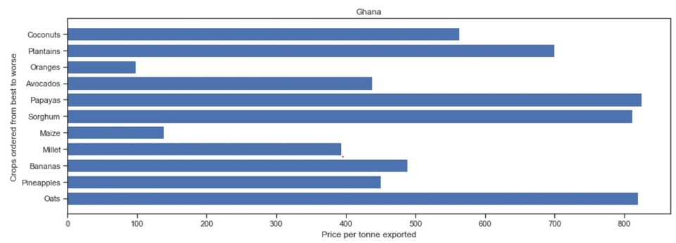
The same selection is shown for Ghana. Coconuts and plantains are this time the most optimal crops. Once again those are appropriate crops as they are tropical fruits.

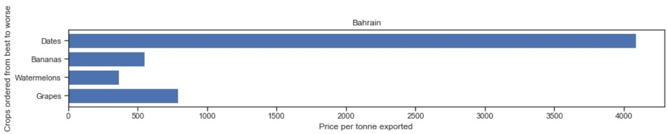
For the case of Bahrain the selecion we get is really small, this is due to the fact that there are not a lot of crops circulating in this country that were documented by the FAO dataset. The element we desire to replace, watermelon is even in the selection that we propose. This is, nonetheless, still a crop to definitely avoid because of the proven correlation between its exportation and the area of forest burned. The country should therefore focus on dates or bananas.
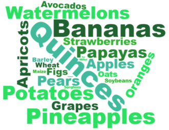
Finally, for South Africa we once again have a big selection. Our top recommendation is composed of quinces, bananas and pineapples.
To summarize, we succeded in advising these 4 countries to grow a sustainable crop. Each of them has the choice between a list of crops that we considered "sustainable" by looking at the spatial yield and the local consumption. Depending on how much the country is willing to lose at the advantage of being sustainable, we also ranked the short-listed crops by their economical yield. The country could then select the crop by balancing economical and sustainable factors. This model could of course be extended to a larger scale to more countries but we decided to focus on countries that were already producing a "destructive" crop and that they could replace it by one of the products of the list. Of course, this model is based on only 4 datasets and would need to be investigated further, using other data to guarantee its viability.